
 August 8, 2025
 0 comments
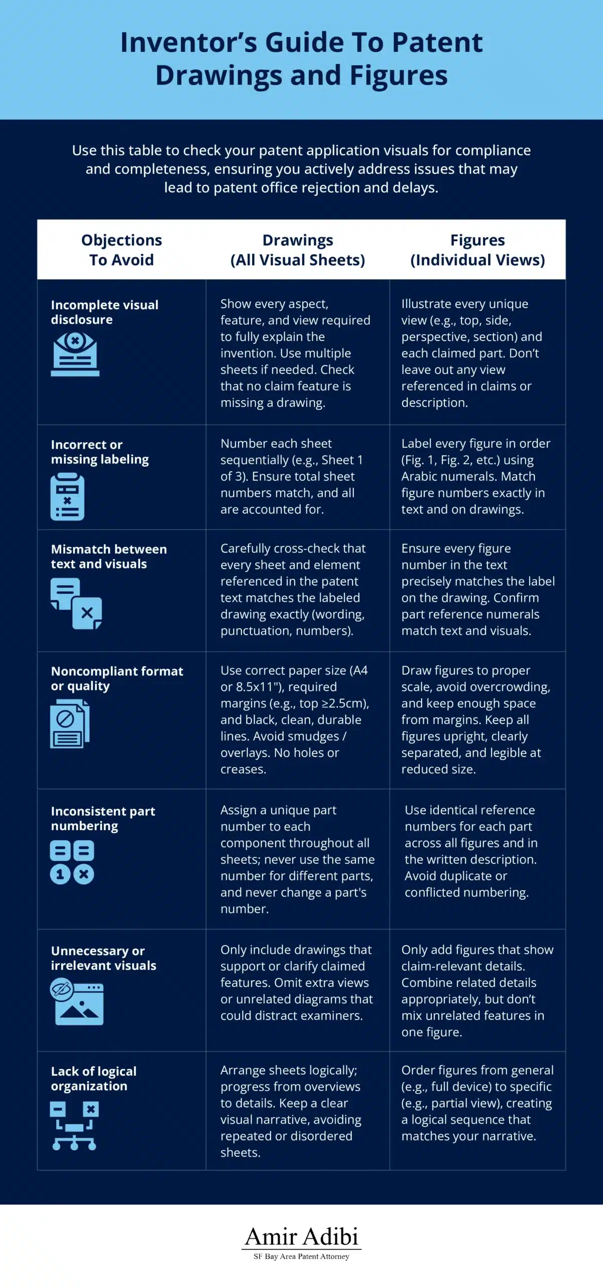
You can have a brilliant invention and still watch your patent application fall apart, simply because your patent drawings and figures were mislabeled or unclear. It happens more often than you’d think. Many inventors treat “drawings” and “figures” as interchangeable. They’re not. In patent filings, drawings are the full set of visuals in your filing whereas figures are the specific, numbered images that show the invention in detail. Mixing them up can lead to confusion, delays, or outright patent rejection.
In this guide, we’ll walk through the key legal definitions, formatting requirements, and visual strategies that make your patent application stronger.
Key Takeaways
- “Drawings” are the full set of visual sheets, while “figures” are the individual numbered views within those sheets.
- Patent offices impose strict formatting and referencing rules that impact whether your application proceeds or stalls.
- Smart visual planning improves how well your claims hold up and how easily you can enforce them later.
Understanding Terminology and Legal Distinctions
Patent terminology directly shapes how your patent application specifications are evaluated. Understanding how patent offices define and use visual terms makes it easier to submit drawings that meet formal requirements and support your legal rights. It also helps you avoid costly missteps, like needing to refile corrected visuals or facing months of delay over a fixable oversight.
Drawings vs. Figures: Defining the Terms
Drawings are the entire collection of visual sheets that form part of your application. They may contain multiple patent figures that depict different views of your invention.
Figures, on the other hand, are the individual, labeled illustrations on those drawing sheets. Each figure shows a unique view or feature, like a top-down view, a cross-section, or a specific component.
Think of patent drawings as the full storyboard and patent figures as the individual frames. Mislabel one, and the narrative falls apart.
The distinction is critical because patent drawings are mandatory when they help explain what your invention is or how it works. Each figure must be labeled in sequence (e.g., Fig. 1, Fig. 2), and these labels must match what’s referenced in your patent application specifications.
If they don’t match exactly, even something as small as “Fig 3” in text but “Fig. 3” in the drawing, you could get an objection. The details aren’t petty, they’re procedural landmines.
Examiners look at the entire drawing set for a full understanding, but they rely on individual patent figures for detailed analysis. When you file amendments or continuations, you’ll need to point to specific figures rather than broad drawing sheets.
Misnumbered patent figures or vague callouts can confuse not just the examiner, but your own legal counsel later, when defending or enforcing your patent.
The core terms to know include:
- Drawing sheets: The physical or digital pages that contain your visuals
- Figure numbers: Labels identifying each separate illustration
- Drawing elements: Labeled parts or components within a figure
- View designations: Types of views (e.g., perspective, cross-section, exploded) that help explain how your invention functions
Legal Framework Governing Patent Visuals
The way patent drawings are treated in patent applications is governed by detailed regulations, especially Title 37 of the Code of Federal Regulations. These rules spell out everything from how your sheets should look to what can cause rejection.
Basic drawing rules include:
- Use black ink on white paper.
- Follow margin specifications.
- Use acceptable line weights.
- Stay within standard sheet sizes.
If your invention can’t be understood without visuals, 35 U.S.C. § 113 makes drawings a necessary component of the application. Failure to follow these requirements can result in delays, formal objections, or rejection.
Those rejections don’t just sting. They stall your protection, delay licensing deals, and inflate legal fees.
The Manual of Patent Examining Procedure (MPEP) provides deeper guidance. Your drawings must clearly communicate structure, function, and components, not just serve as rough sketches. In other words: no back-of-the-napkin diagrams. The rules expect engineering-grade visuals–clean, complete, and consistent.
Specific rules around figures cover:
- Numbering patent figures sequentially
- Matching reference numbers to the written description
- Using approved shading and hatching conventions
- Showing exploded or sectional views correctly
Mess up any of these details, and you’ll receive a drawing objection that must be corrected before your application moves forward.
Preparing a Patent Submission: Technical Requirements and Standards
Every visual in your patent application must follow a defined set of technical standards. These aren’t optional. They determine whether your submission is legally compliant and understandable to a patent examiner.
Format and Presentation Requirements
The USPTO has strict formatting rules to ensure patent drawings are consistent and readable. Black and white line drawings are standard, though certain technical situations may allow exceptions.
If color is critical for understanding your invention, you can request approval, but that requires a petition and an additional fee. Black and white photos are only allowed when line drawings aren’t sufficient to explain the invention.
For mechanical inventions, use solid black lines on white paper. Vary line thickness to distinguish between components. Shading and stippling are only allowed in specific, justified cases.
For cross-sections and cutaways, follow proper hatching standards. Different materials must have clearly distinct hatching patterns to avoid ambiguity. Perspective views should maintain correct proportions to reflect 3D structure.
Figure layout matters too. Arrange views strategically: save space, but never at the expense of clarity.
When multiple figures relate to the same version of the invention, they can share a sheet, provided they remain legible. Crowded sheets frustrate examiners and increase your risk of a formatting rejection.
Numbering and Labeling Conventions
Your reference numbers must be consistent across the entire application. Each part or component gets a unique number that doesn’t change between patent figures or in the description. Lose track of numbering once, and your spec might not match your drawing set.
Use bold numerals, large enough to be easily readable. Position them close to the elements they identify without overlapping key details. Use leader lines when needed to connect numbers to parts. Sloppy or cramped labels are more than just cosmetic errors. They confuse the examiner and weaken your claims.
When preparing a patent submission, consistency in figure labeling is crucial to avoid delays. Figures must be numbered sequentially, starting with Fig. 1. The numbering should match the order in which figures are discussed in the patent application specifications. Even if one figure contains multiple views, the overall sheet still needs a clear identifier.
If Fig. 3 is referenced before Fig. 2, or appears twice with different views, expect a formality objection and a rewrite request.
Use numbers instead of letters for most references. Letters can work for small variations, but stick with numbers when clarity matters. Never use the same number for different elements or switch numbers for the same component across figures. Many applicants overlook these details while preparing a patent submission, leading to objections or costly revisions.
Strategic Considerations for Different Patent Types
Patent visuals aren’t one-size-fits-all. What works for a utility patent won’t necessarily serve a design patent. Each type of patent has its own rules that affect protection and enforceability. Misunderstanding the difference means you risk filing the wrong type of visual support altogether, which can tank your chances before your claims are even reviewed.
Utility Patent Drawing Strategies
Utility patents require precise, technically accurate visuals that support every element of your claims. These visuals aren’t decorative, they’re proof of what your invention does and how it works. Think of them as part blueprint, part evidence. If they’re vague, messy, or incomplete, examiners will assume your claims are too.
Start with multiple views to show various sides, functions, and configurations. Include perspective drawings, cross-sections, and exploded diagrams as needed. Each one adds context that helps the examiner understand your claims.
Reference numerals must align with your description. If you label a component “104” in a figure, it must also appear as “104” in the text. Inconsistent labeling weakens credibility and invites extra scrutiny.
Make sure the visuals include enough information for someone skilled in the field to replicate your invention. That’s the legal test of sufficiency and vague illustrations don’t pass. Your invention might be novel and brilliant, but if the visuals don’t make it replicable, you’ve essentially submitted a sketch, not a spec.
Use shading and hatching per USPTO rules to distinguish materials. If your invention combines metal, plastic, and glass, those differences should be obvious in the visuals.
Avoid any non-essential decoration. This isn’t the place for aesthetics. Your goal is clarity, not visual flair. Every line should serve a technical purpose, not just fill space. This kind of precision is essential when preparing a patent submission for a mechanical or electrical invention.
Design Patent Visual Requirements
For design patents, the visuals are the claim. You’re not protecting how the invention works, but how it looks. So precision and presentation matter above all else.
You’ll need multiple views—front, back, left, right, top, and bottom. Each one needs to be free of distortion and true to the actual object being protected. A missing angle can give competitors an open window to copy the part you left out. Yes, they’ll look for those gaps.
Solid lines show what’s claimed, while broken lines indicate what’s not. This affects your claim scope and must be used consistently and correctly. Misuse them, and you may accidentally exclude key features or include ones you didn’t intend to protect. That can cost you more than just office action fees.
Think of design patent drawings like product photography. Lighting, background, and contrast must all support a crystal-clear rendering of the ornamental design.
Textures and finishes, like matte, glossy, or patterned surfaces, must be depicted using standard shading conventions. The USPTO expects surface characteristics to be visually understandable at first glance. If the finish affects how the design looks, it needs to be visible. Forget to show it, and it’s not protected.
Don’t rely on text or context to carry your design. If something’s not shown, it’s not protected. Functional aspects can appear for context, but the focus must stay on visual form, not mechanical function.
You can’t explain away what’s missing in the drawings. Patent law won’t assume or infer. It only protects what’s visually present and properly marked.
Practical Implementation and Best Practices
Producing patent drawings that hold up in prosecution, and across borders, requires smart decisions about how they’re created, who creates them, and how well they meet international norms.
DIY vs. Professional Patent Illustration
Balancing Costs and Quality
If your invention is relatively simple, you might save money by doing the drawings yourself. For some straightforward mechanical designs, DIY illustrations are often good enough. But before you open up your drawing software, ask yourself this: Are you confident enough to bet your patent on it?
If your design includes detailed mechanisms or tight tolerances, consider hiring a pro. Professional illustrators are better at cross-sectional hatching, exploded views, and multi-layered diagrams that require technical accuracy.
They also know what examiners flag because they’ve seen it dozens of times before. That experience can save you thousands in revisions and delays.
If you’re unsure where your invention falls, lean professional. The upfront cost often pales in comparison to the price of rework and refiling.
Minimum Quality Standards Apply Either Way
Regardless of who creates them, drawings must be clean, labeled correctly, and technically accurate. DIY efforts often fall short in maintaining accurate scale and alignment across views.
Professionals, by contrast, instinctively understand these nuances. They can help you avoid common pitfalls, like inconsistent line weights or mislabeled reference numbers, that can trigger objections.
International Considerations
Patent offices around the world have different expectations for visual content. While the USPTO permits basic black-ink drawings, other jurisdictions, like the European Patent Office, may demand higher precision or alternate formats.
If you’re planning to file internationally, design your patent drawings with the most rigorous standards in mind. This reduces the need for reformatting later, saving time and money.
Elements requiring extra attention for global filings:
- Reference number placement rules
- Projection line uniformity
- Partial view labeling accuracy
- Exploded view presentation conventions
European offices often require greater technical accuracy, while Japan places special emphasis on cross-sectional clarity. Meeting these early ensures your visuals aren’t the bottleneck in a multi-country strategy. When you’re spending thousands to file in each region, the last thing you want is a redraw request from an examiner in Munich because your hatching wasn’t crisp enough.
Best bet: standardize to the highest common denominator. If you’re pursuing protection across multiple countries, aim to exceed the strictest requirements. Investing in high-quality master drawings from the start prevents future setbacks and avoids costly redos.
Your Visuals Can Make or Break Your Patent
Patent drawings aren’t just technical niceties. They’re legal instruments. The difference between a figure and a drawing may seem like semantics, but in the patent world, it can be the difference between a smooth grant and a stalled, expensive slog through objections and rejections.
If you’re serious about protecting your invention, you need to take your visuals as seriously as your claims. That means using correct terminology, following strict formatting rules, and, when needed, bringing in professional illustrators who know how to meet global standards from the start. It’s not just about getting your patent through the USPTO. It’s about building a rock-solid asset you can license, enforce, and defend in any jurisdiction.
Ready to make sure your drawings hold up under real scrutiny? Contact us today to work with a team that knows exactly how to bridge legal requirements with practical strategy, because a strong patent starts with the details.